


 Reply With Quote
sweet look..

Results 1 to 10 of 10
Thread: New Logo
-
10-23-2009, 01:57 PM #1*TPO Founder*

- Join Date
- Jan 2007
- Location
- New York, New York, United States
- Posts
- 1,373

New Logo
New logo courtesy of Oscar or Trout5
I yellow and blacked it to work with our scheme.
[smg id=450]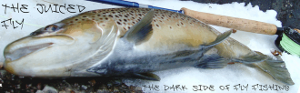
"What you see going by is a shadow.
You've got to live in front of your eyes"
-
10-23-2009, 02:15 PM #2*TPO Rockstar*
- Join Date
- May 2008
- Location
- Candlewood Valley
- Posts
- 721
Re: New Logo
-
10-23-2009, 03:39 PM #3alanb_ctGuest
Re: New Logo
I appreciate the effort (and can't offer anything better), but think it looks too much like the Loomis logo.
-
10-23-2009, 04:39 PM #4Alaskan Steel
- Join Date
- Mar 2009
- Posts
- 699
Re: New Logo
Yes it does look like the loomis logo, its not the design though, its the color.It would look really good on a letter head though or bussines card(Black on white)
-
10-23-2009, 07:18 PM #5Senior Member
- Join Date
- Nov 2007
- Location
- portland OR
- Posts
- 676

Re: New Logo
im not sure what to say ,came through on my yahoo to check it out ,looks a bit stiff like a dead fish neon light .wish i was over that way could draw up something with more life ,maybe trout five could do one with the TPO in a jumping fish or something ,but hey its your site so i just making a suggestion .
fish on ,I caught a 100 pound sturgon on 20lb test!
-
10-23-2009, 08:07 PM #6BlackLabelGuest
Re: New Logo
Aaron showed me the logo last week and I said it was awsome and I still think it is. Great job Oscar! I wouldn't chande a thing.
-
10-24-2009, 02:40 AM #7Senior Member
- Join Date
- Nov 2007
- Location
- portland OR
- Posts
- 676
Re: New Logo
looks like a dead fish >
 fish on ,I caught a 100 pound sturgon on 20lb test!
-
10-24-2009, 07:31 AM #8*TPO Rockstar*
- Join Date
- Jul 2008
- Location
- Brooklyn,ct
- Posts
- 992
Re: New Logo
I like the dark side of fly fishing logo the best. A t - shirt with that logo would rock
-
10-24-2009, 12:16 PM #9Senior Member
- Join Date
- Feb 2009
- Location
- Phillipsburg, NJ
- Posts
- 1,044
Re: New Logo
I like the logo. Its got a modern look to it and I think that look reflects the attitude of this website.
"A trout is a moment of beauty known only to those who seek it."
~by Arnold Gingrich~
http://smg id=55
-
10-24-2009, 12:52 PM #10Senior Member
- Join Date
- Nov 2007
- Location
- portland OR
- Posts
- 676
Re: New Logo
i agree with wwelz ,that is cool looking and if it had TPO under it it would look awesome ,the other one dead fish ;D
fish on ,I caught a 100 pound sturgon on 20lb test!

Similar Threads
-
Echo Nymph Man Logo
By pete erickson in forum Other ProductsReplies: 8Last Post: 10-18-2024, 02:30 AM
